Making complex race data analysis almost playful
Project
Driven by Data
Collaboration
HofSpannung Motorsports e. V.
Website
Hosted on Netlify
Type
INTERACTION
DATA
WEB
Tools
VS CODE + CLAUDE
GIT
FIGMA
Year
2026-present

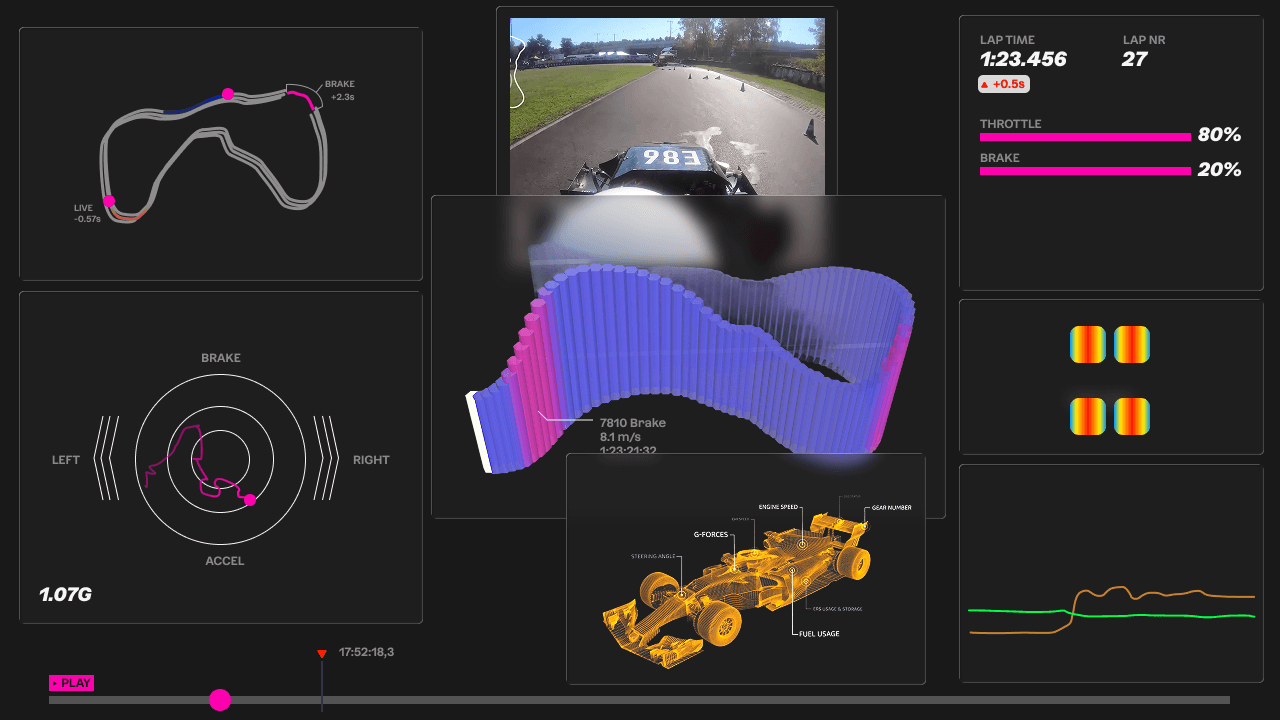
The dashboard not only makes analyzing data more comprehensive, it also helps bystanders understand what performance the team actually delivers. At our semester showcase, the dashboard was presented on a large TV for visitors to freely explore the races.


A redesigned HUD keeps the driver focused on crucial battery data. The screen is supposed change based on the teams needs – whether it's driving, monitoring error logs or tweaking settings. The HUD is still in development.
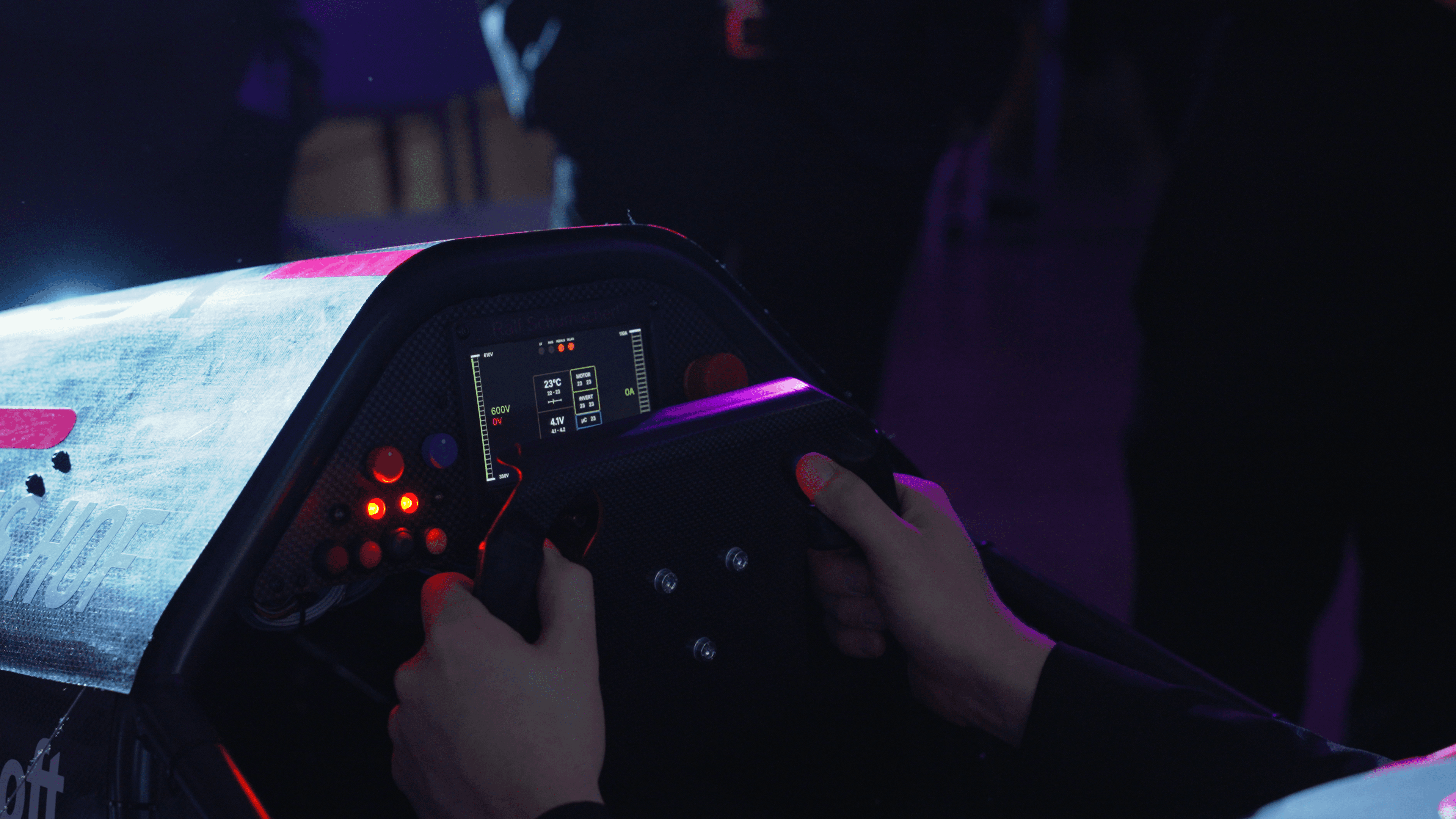


before redesign
after redesign (prototype v1)

Concept
At first I came up with three possible directions for making use of the data: 1) improving the race car's HUD 2) building a tool for complex data analysis 3) using the data to tell a story about the team's performance. I opted for storytelling and ended up with merging all three aspects. It now offers the possibility of adding more data for analysis, making the project public as subpage on their offical website for PR or to further improve the HUD.


Process
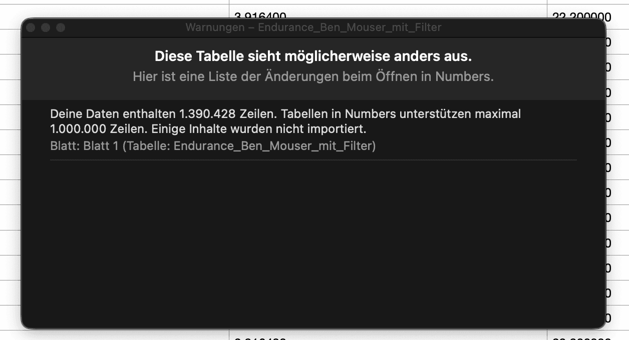
I started by joining the team on their track days to better understand their needs, pain points and the technical aspects of the car. As the car is packed with tons of sensors, we had to pre-select certain data values to get CSV files that won't crash my mac when trying to opening them. Huge thanks to Niklas Moser who wrote a beautiful documentation explaining every CSV column-name – without this I wouldn't have been able to go on. However, the files still had to many rows to be opened in any spreadsheet app. I found a workaround by extracting CSV values using a custom python script and the terminal. The trickiest part was filtering all faulty data with bounding boxes, value-gates, etc. until only relevant data points with correct GPS-values remained. Finally, I was able to build graph by graph, reformatting values on the go. To do that, I used VS code with the Claude plug-in. I pushed every change to git/github and hosted the dashboard with netlify.



Learnings
Handling huge data
I had never worked with large amounts of data before. Now I found a rock-solid workflow which enables me to realize almost every concept I can think of.
AI Lock-in
At first, I was using the free version of Claude in my browser to write python scripts which worked fairly well. When it came to intentionally designing the dashboard graphs I felt like I didn't have any control. I was simply promting the functionality while Claude did the design part (fairly bad). It drastically changed when I started paying for Claude Code Pro which enabled me to incorporate large changes while staying close to the code. However, I now paid 22€ per month.
Working with experts
My work depended on expertise and data of different departments like the design, IT or electrical engineering team. I had to quickly identify what exactly I needed and from who exactly I could get it. Otherwise I would have lost too much time waiting on their responses – week by week.